
How to Use SVG Icon as AvatarBadge in Chakra UI
I was recently building a side project and I was using Chakra UI + Next.js. I wanted to put the Google logo as a Badge in the bottom right of an Avatar Image. Something like this👇🏻. Chakra UI provides an Avatar and AvatarBadge component. You can u...
I was recently building a side project and I was using Chakra UI + Next.js. I wanted to put the Google logo as a Badge in the bottom right of an Avatar Image. Something like this👇🏻.
Chakra UI provides an Avatar and AvatarBadge component. You can use these two to create an avatar image with a badge(bottom right). Here is an example from Chakra UI docs.
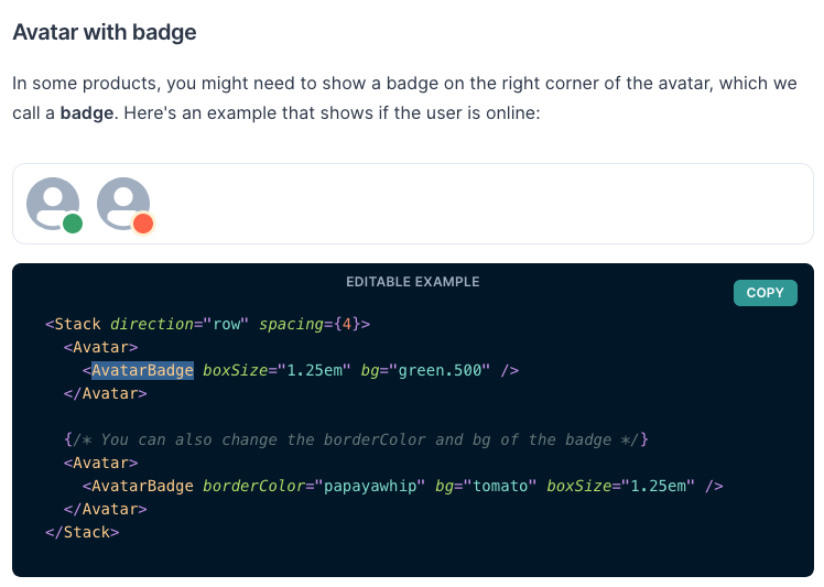
Now suppose instead of the dot you want to insert an SVG icon. Here is how you can do it.
import { Avatar, AvatarBadge, Icon } from "@chakra-ui/core";

const GoogleIcon = (props) => (
  <svg viewBox="0 0 533.5 544.3" {...props}>
    <path
      d="M533.5 278.4c0-18.5-1.5-37.1-4.7-55.3H272.1v104.8h147c-6.1 33.8-25.7 63.7-54.4 82.7v68h87.7c51.5-47.4 81.1-117.4 81.1-200.2z"
      fill="#4285f4"
    />
    <path
      d="M272.1 544.3c73.4 0 135.3-24.1 180.4-65.7l-87.7-68c-24.4 16.6-55.9 26-92.6 26-71 0-131.2-47.9-152.8-112.3H28.9v70.1c46.2 91.9 140.3 149.9 243.2 149.9z"
      fill="#34a853"
    />
    <path
      d="M119.3 324.3c-11.4-33.8-11.4-70.4 0-104.2V150H28.9c-38.6 76.9-38.6 167.5 0 244.4l90.4-70.1z"
      fill="#fbbc04"
    />
    <path
      d="M272.1 107.7c38.8-.6 76.3 14 104.4 40.8l77.7-77.7C405 24.6 339.7-.8 272.1 0 169.2 0 75.1 58 28.9 150l90.4 70.1c21.5-64.5 81.8-112.4 152.8-112.4z"
      fill="#ea4335"
    />
  </svg>
);

export default function Home() {
  return (
    ...
    <Avatar>
      <AvatarBadge boxSize="1.25em" borderColor="transparent" bg="white">
        <Icon as={GoogleIcon} w="5" h="5" />
      </AvatarBadge>
    </Avatar>
    ...
  );
}
In the above example, There is GoogleIcon SVG. Then I am creating an Icon component using GoogleIcon SVG. Then we pass this Icon component as children to AvatarBadge.
Similarly, if you want to create a Badge with an image. You can just replace the Icon component with Image and it will render the image as a badge.
import { Avatar, AvatarBadge, Image } from "@chakra-ui/core";

export default function Home() {
  return (
    ...
    <Avatar>
      <AvatarBadge boxSize="1.25em" borderColor="transparent">
        <Image src="https://raw.githubusercontent.com/chakra-ui/chakra-ui/develop/logo/logomark-colored%402x.png" />
      </AvatarBadge>
    </Avatar>
    ...
  );
}
Conclusion
Chakra UI is an awesome library that provides modular components. You can use this library as a building block for creating custom components. It was very simple to build custom components.